
CASE /// INVENTED SCENIC-FLIGHT OPERATOR · SHOWCASE
Doppeldecker am See
Concept by RAVAROInvented example: the operator doesn't exist, the website does.
What if your customer had already been on the flight before booking it? A scenic flight over Lake Constance that you fly yourself by scrolling, built from flat pictures that stand one behind the other like the scenery of a Baroque stage. After landing you issue the flight voucher.
doppeldecker-am-see.vercel.app
Go to the siteBest to fly it yourself first, then read on here.
Opens in a new tab
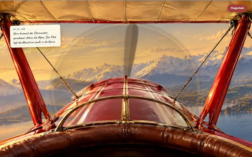
What does a scenic flight sell?
Not the aircraft and not the route, but the moment the clouds open and the lake lies below. Whoever gives a flight as a gift is buying that feeling for someone else, and buying it without ever having had it.
That is exactly what most websites leave out. They show a large photo with a headline; the visitor looks at the place and is not there. This is not only true of scenic flights, because a hotel, a joinery or a day-trip destination also sell something you only understand once you have experienced it.
Nobody ordered this site. It belongs to a series of example sites we build without a client, so that we have a free hand and can show what is possible instead of inventing client results.
→ So the question was: can a website take someone along on the flight?
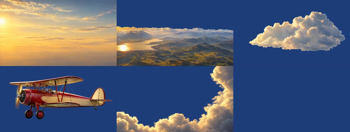
Not a film and not 3D. Stage scenery your customer flies through.
A film plays whether anyone is watching or not, and after a few seconds the thumb has moved on. Here nothing happens as long as the visitor does nothing, and everything happens as soon as they scroll: the biplane dips into a cloud, the lake opens up below, Lindau drifts past, the Alps stand ahead of the nose, and at the end the aircraft touches down on the grass. Scroll back, and it flies back.
It is built neither as a film nor as a 3D world, but from flat pictures. Every scene consists of separate pictures that stand one behind the other like panes in a display case. In the first scene there are five: the sky at the very back, in front of it the mountains with the lake, a cloud, the biplane, and at the very front clouds again. When you scroll, the sky stands still, the mountains drift slowly, and the clouds at the front cover a good six times the distance in the same time. That is how the world looks from a moving train: the fence by the track rushes past, the mountain on the horizon barely moves. Your eye reads depth from that difference, although every single picture is flat.
The idea is several centuries old and comes from the theatre. Baroque stages conjured deep rooms on a flat stage by setting painted flat panels, the wings, one behind the other on the left and right and closing the view at the back with a painted backdrop. The depth came from the staggering and the painted perspective alone. A house from that era stands in Bayreuth: the Margravial Opera House, inaugurated in 1748, its interior designed by Giuseppe Galli Bibiena and his son Carlo, a UNESCO World Heritage site since 2012. The stage machinery of that time has not survived there; today's stage set was newly painted after a drawing by Carlo Galli Bibiena, and the museum of the house has a replica of the Baroque stage where visitors may operate the scenery drive themselves. We took this principle from the stage to the screen and added one thing: with us the scenery moves while your customer scrolls.
What you get out of it: your customer has the impression of a film, although no day of filming and no 3D production was needed. Only pictures are loaded, which is why the flight also runs on a phone. How long your customer waits for it there is given as a measured value further down.
Sources: UNESCO · Markgrafenkultur Bayreuth · Wikipedia: Kulissenbühne (German)
Not a minute of film was shot for this site, and the visitor has flown all the same.
→ Before the first picture existed, though, something else was already settled.
Every scene answers one of your customer's questions
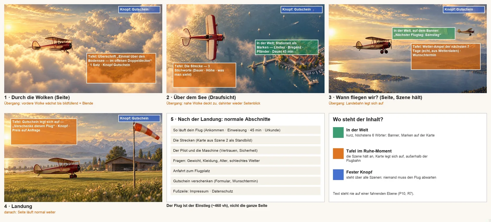
We never start with pictures, but with the questions someone has before they buy. Whoever wants to give a flight as a gift has four: What does it feel like? What do you see up there? When is flying possible? And how do I get the voucher? Each scene answers exactly one of them, in that order.
The first storyboard showed only the flight. Ralph asked where the information of the site actually sits. Since then every piece of information has its place: the next flying day is on the banner of a second aircraft, route and weather appear on cards when the scene rests, and the voucher button stays within reach the whole time.
Why this way: a flight without information is a beautiful film, but it sells nothing. And whoever wants to buy after the second scene should not have to wait for the landing.
→ That leaves the fourth question, and it is where most beautiful sites fail.
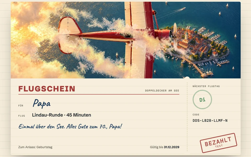
Whoever lands is holding a flight voucher
For us a showcase is not a mock-up. Everything a real operator would need has been built and clicked through; only the money does not flow.
After the landing, the flight voucher lies where the aircraft stood a moment ago. It is issued in five steps, with a name, one of four motifs and a dedication, and it visibly grows as you fill it in. Whoever receives it redeems it with their code and picks the day themselves.
The site answers an obvious worry about giving this gift before anyone voices it: what if the weather isn't right? A traffic light shows from real forecasts on which of the next seven days flying is possible, and days without flying weather cannot even be selected when redeeming.
For you it may not be a flight voucher but a gift card, an appointment or an enquiry. The thought is the same: the purchase sits where the desire is greatest, and by then the biggest worry has already been answered.
None of the operators we looked at beforehand shows the flying weather. Here the next flying day is on the banner, in the checkout and on the voucher.
→ On the large screen all of that looked good. Your customers see it on a phone.
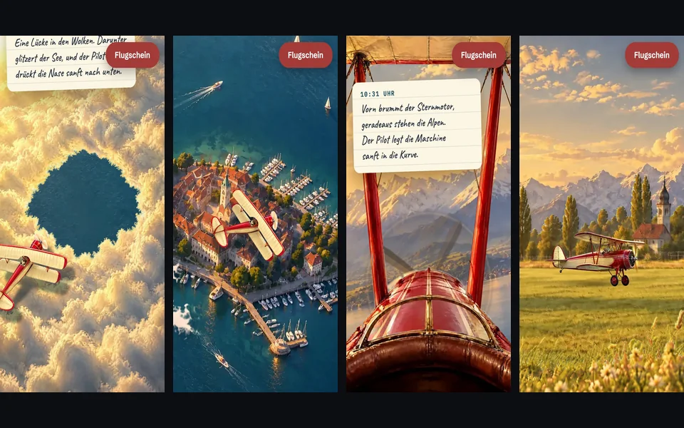
On the iPhone it looked different
Whether a site holds up is decided on the phone, because there the screen is small and patience is short. Ralph scrolled through the flight on an iPhone and recorded it, and what ran smoothly on the desktop had 17 faults there.
Any customer would have noticed three of them. The flight was over after a few swipes, one per scene; today every scene lasts at least two and a half. In one place the biplane flew sideways to its own nose. And the propeller in the cockpit first looked like a bright circle, then like a smudge; it was redrawn in four rounds until you recognise it as a propeller.
Why so much effort for small things: an aircraft that flies sideways bothers even the person who cannot say what is bothering them. Afterwards they trust the rest of the site a little less, and with it the business behind it. 16 of the 17 faults are fixed, one of them in part.
→ What we could not see, we measured.
Measured, not estimated
The biggest fault was not visible in any screenshot: on a phone, the large picture of the first scene only appeared after 8.4 seconds, and nobody waits that long for a scenic flight. After the rebuild it was 2.1 seconds in the test on our own machine. On the published site we measure a middle value of 3.4 seconds on a phone; the individual runs lie between 2.3 and 3.5. That is clearly better than before and not yet where we want it.
Whether the site works is not something we judge ourselves. A review that did not build the site gave the published version 78 out of 100 points on 12 October. It found the flight with the real weather and the checkout up to the voucher strongest, and the way to us weakest, because it appeared only once, at the very end. We have since added that pointer at the checkout and when redeeming.
Measured
→ The way there was not a straight line.
What went wrong and what we learned from it
- What happened
The biplane flew backwards, twice: first on the site, then in three of the four storyboard pictures.
→ What we do differently sinceThe flight direction is stated in every image order and checked on the storyboard already. A fault the visitor sees in the first second no longer makes it to the finished site.
- What happened
On a phone the first draft was over after a few swipes. Ralph's verdict: thin for the effort.
→ What we do differently sinceFour scenes became six, and how long a scene lasts on a phone is counted instead of estimated. The visitor should arrive before it is over.
- What happened
On a real iPhone there was a box around the aircraft that was not visible in any of our tests on the desktop.
→ What we do differently sinceTesting happens on the device the customer is holding, not only in the simulation on the desktop.
- What happened
Our own score was higher than that of the outside review. The main reason, the waiting time on a phone, was not visible in any screenshot.
→ What we do differently sinceThe outside score is the one that counts, and the waiting time is measured before we call a site finished.
Doppeldecker am See does not exist: operator, fares and flight vouchers are invented, the images made with AI; the site says so itself in the footer and after the purchase. What is real: the weather data and the path through the checkout up to the voucher. No money flows.
On a phone the site loads more slowly than we want, and the latest corrections have not yet been checked on a real iPhone. Built without a commission, it shows what is possible; it does not prove a sales figure.
What this means for your business
The airfield is invented. What is behind it is not: whoever sells an experience can let customers live part of it before they book. A hotel has the drive up and the view from the balcony, a joinery the kitchen that comes together piece by piece, an excursion boat the passage out of the harbour. And at the end of the experience there is no “Contact”, but exactly the thing you want in that moment.
That is exactly how we build your website. And you see it before you decide.
A website that only looks nice is dead weight. Website Systems builds a site from your actual business goals — one that takes work off your plate and turns visitors into real enquiries.
MORE CASES ///
Next build
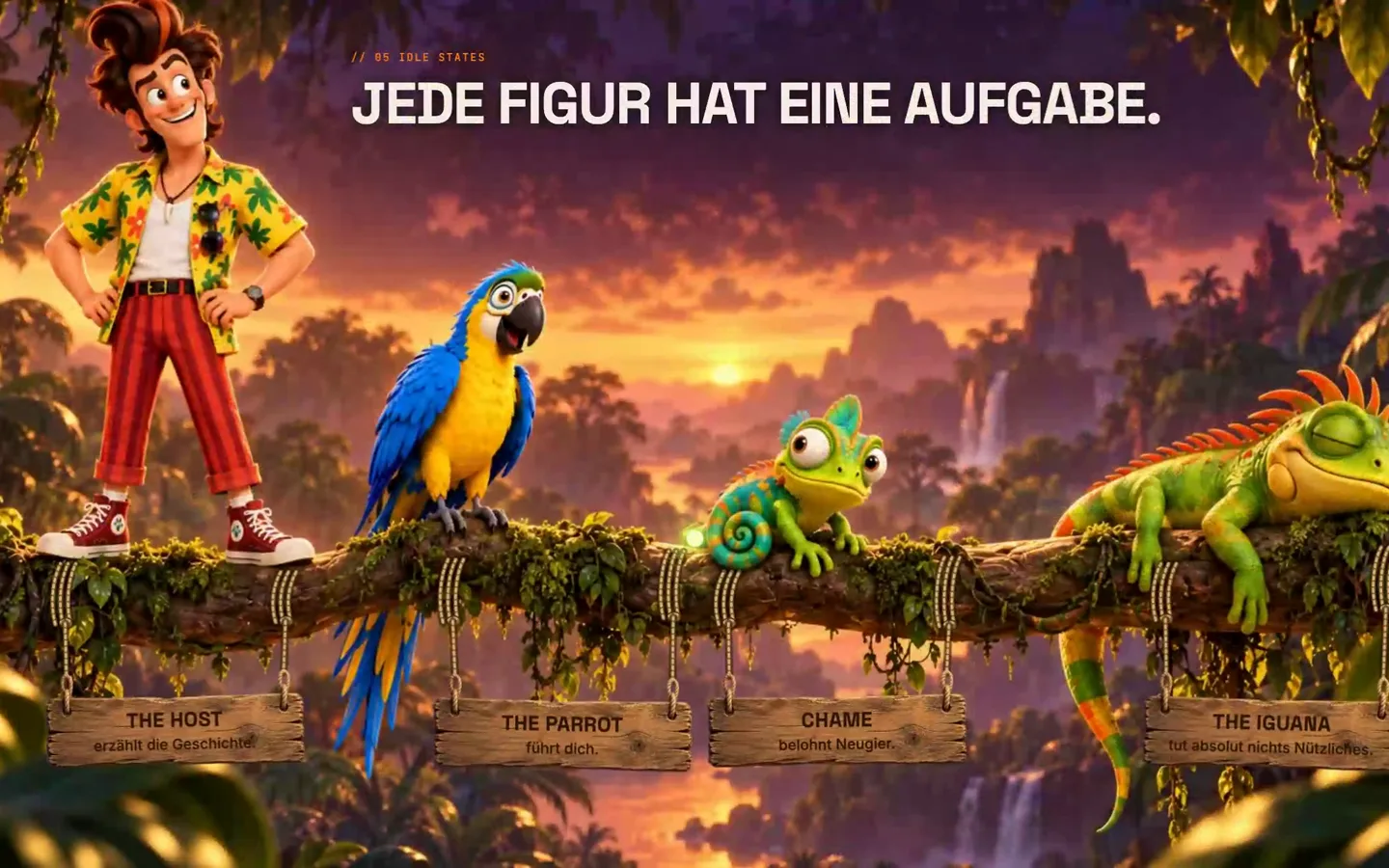
The Next Adventure
What if your visitors remembered your website like a game from their childhood? A host who turns round to look at you, a jungle that grows into the study, twelve stations to play along with — a website you don't read, you play it.
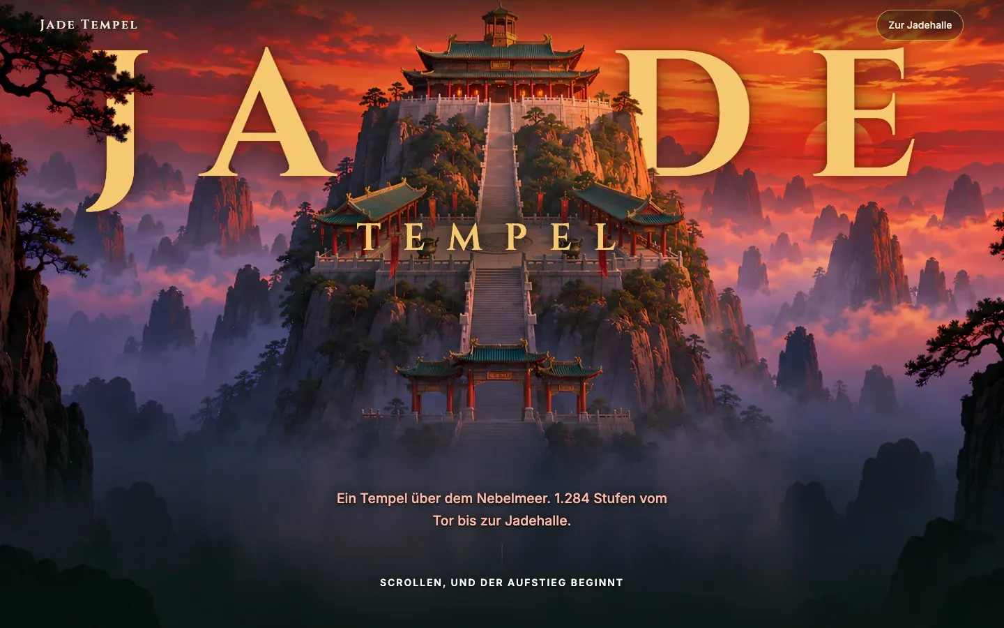
Jade Tempel
What if your guests had already walked the way to you before they set off? 1,284 steps, a hall of jade, a dragon after the storm — a website you don't look at, you climb it.
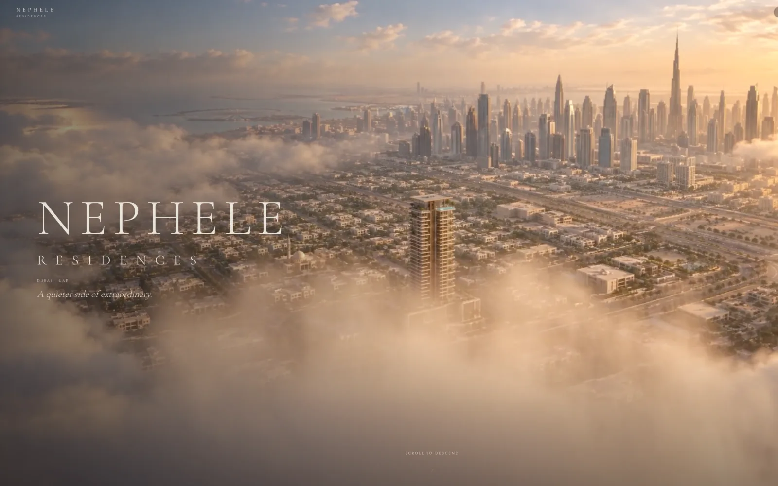
NEPHELE Residences
Nobody buys the development. They buy apartment A1803.
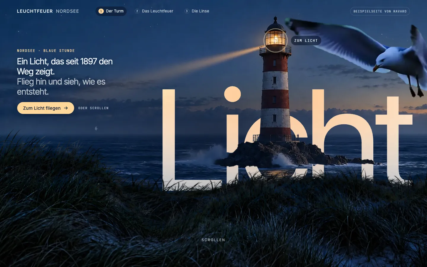
Leuchtfeuer Nordsee
Four days, ten versions, one lighthouse — and a lens you take apart yourself.
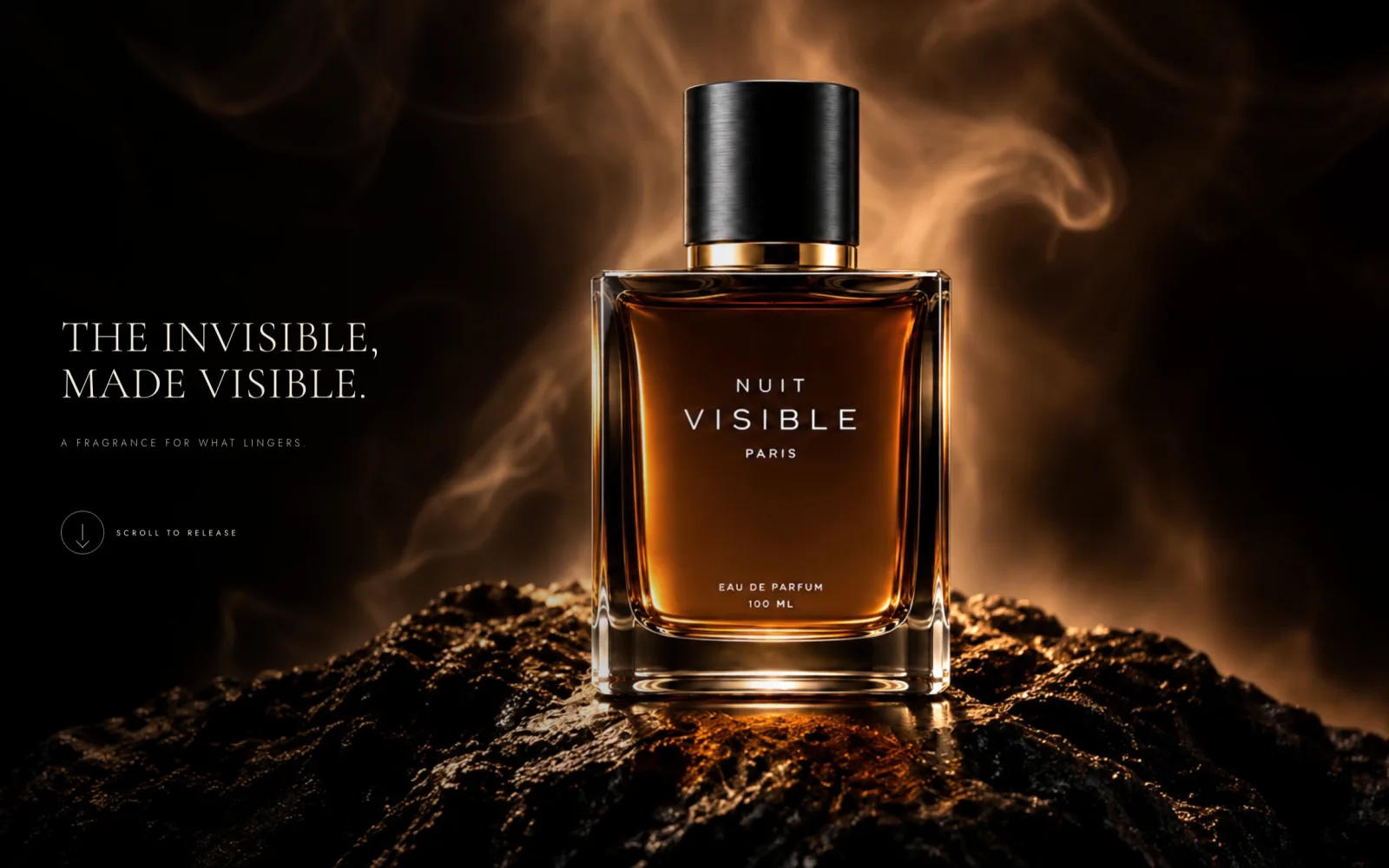
NUIT VISIBLE
A scent cannot be shown. So we let the scroll tell it.
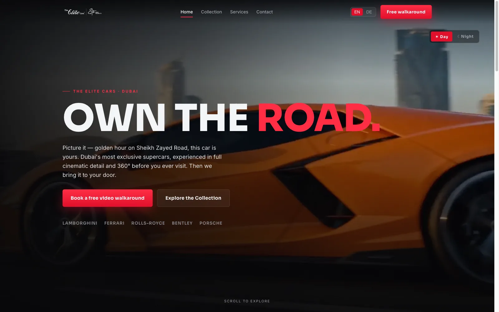
The Elite Cars
A supercar dealer whose website already looked good — and still could not sell a car to someone who didn't feel like driving over.
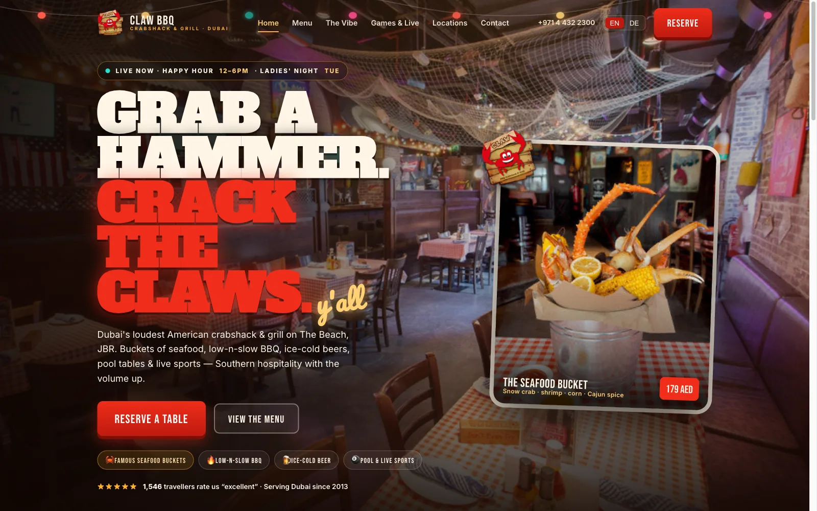
CLAW BBQ
I know this place. Their website did not.
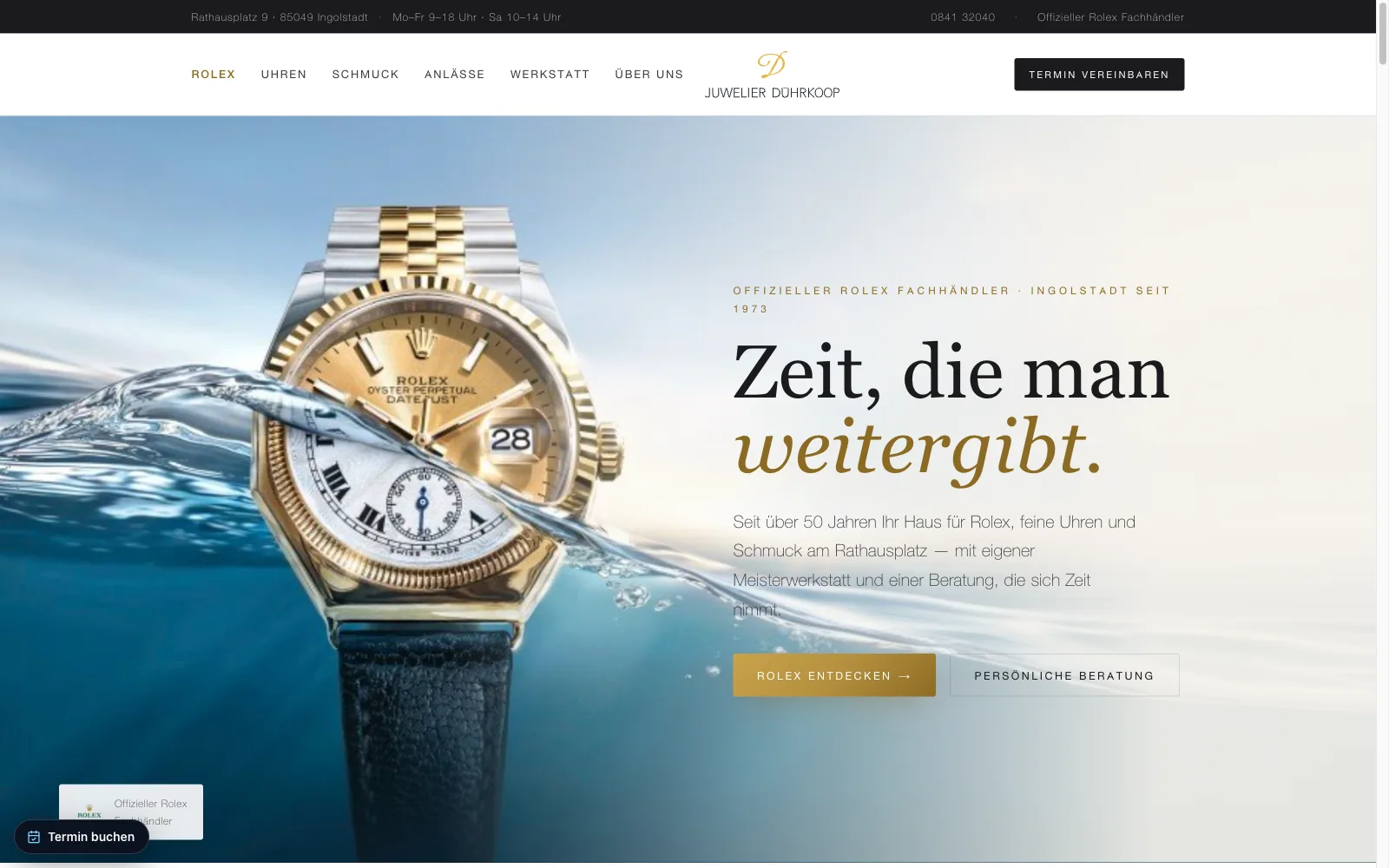
Juwelier Dührkoop
Fine watches, sold from a page you could not lean into.
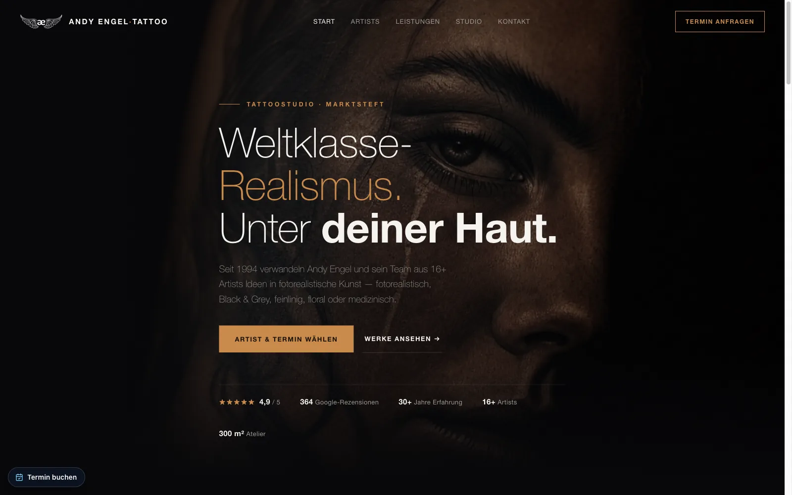
Andy Engel
A man people fly across continents for, with a website built for people driving past.
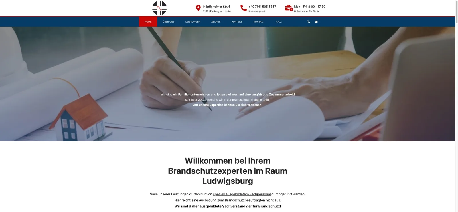
BSD Wiedemann
We stopped his website selling fire extinguishers, so the business could start selling expertise.
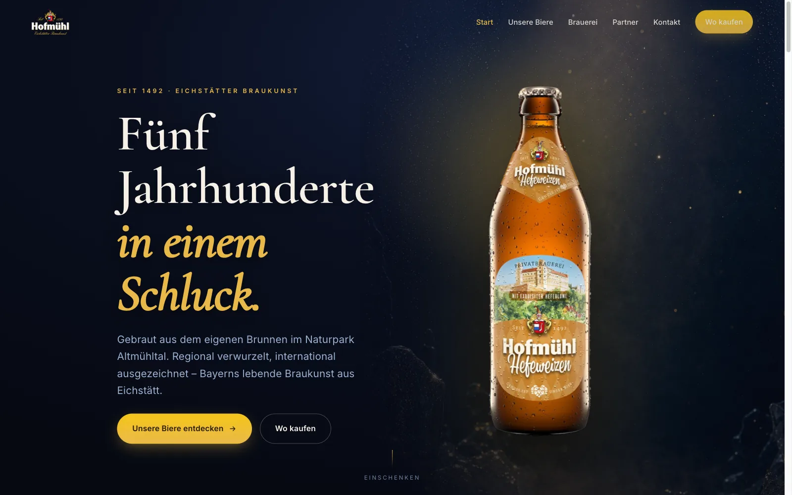
Hofmühl
A brewery does not sell beer on its website. It sells the reason someone reaches for that bottle in the shop.
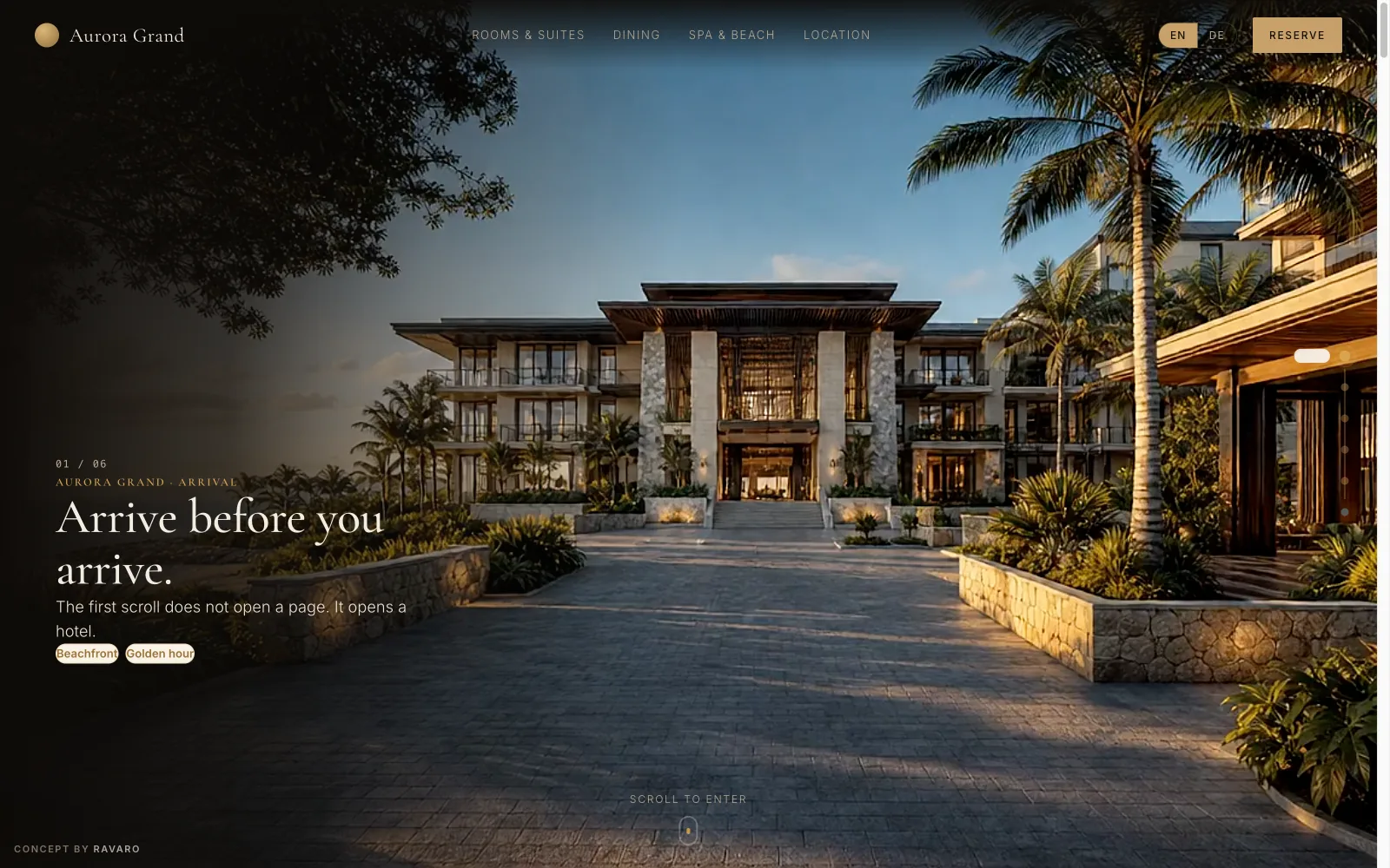
Aurora Grand
A hotel website you walk through before you book.
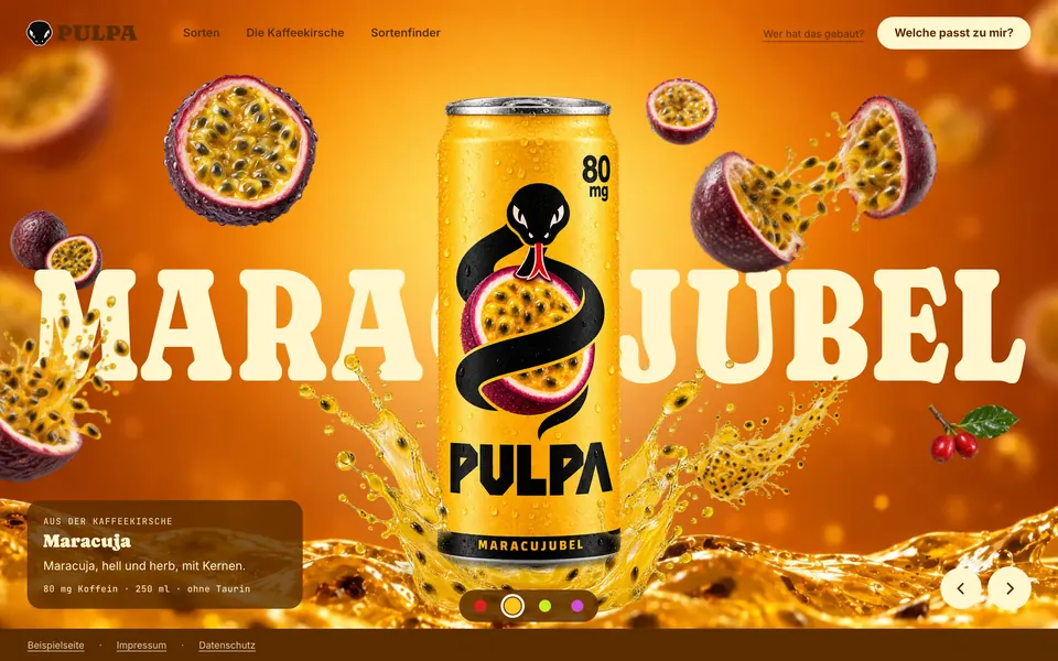
PULPA
A lemonade that doesn't exist, on a website that does things most websites can't.
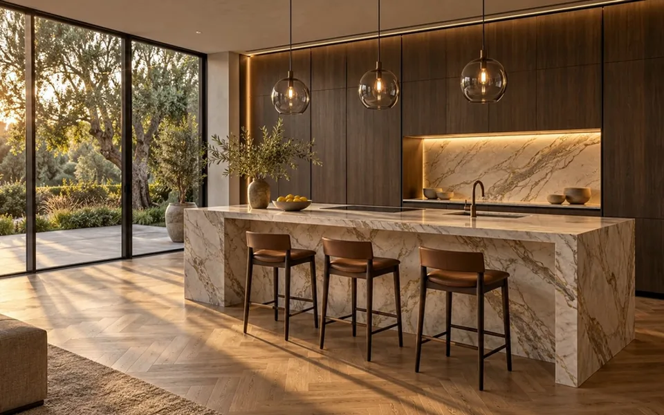
Werrewerk Küchen
What if your customer could stand in their finished kitchen before a single cabinet is built? A kitchen that comes together in a time-lapse, that the visitor restyles with a price, and behind it a business you would trust to build it.
All our website work
Every project in this discipline — numbers, videos and results.