
CASE /// INVENTED DRINKS BRAND · SHOWCASE
PULPA
Concept by RAVAROInvented brand · a RAVARO showcase.
A lemonade that doesn't exist, on a website that does things most websites can't.
pulpa-drink.vercel.app
Go to the siteBest experienced first, then read on here.
Opens in a new tab
Websites that all look the same
Almost every business we talk to starts by saying: “We already have a website.” And usually that's true. It just looks like the one next door: a picture at the top, three boxes, a contact form. Whoever shows up like that gets compared, and in the end the only thing left to compare is the price.
You can explain this, but explanations change very little. Someone who has never experienced what a website can do won't believe it until they've had it in their own hands. So we stopped claiming it and built something you can touch.
→ For that we needed a product everybody knows — and an idea nobody forgets.
A brand that doesn't exist
We invented a soda. Everybody knows a can, no industry feels left out, and whether you want one is decided in three seconds. Those are exactly the three seconds your website has to win as well.
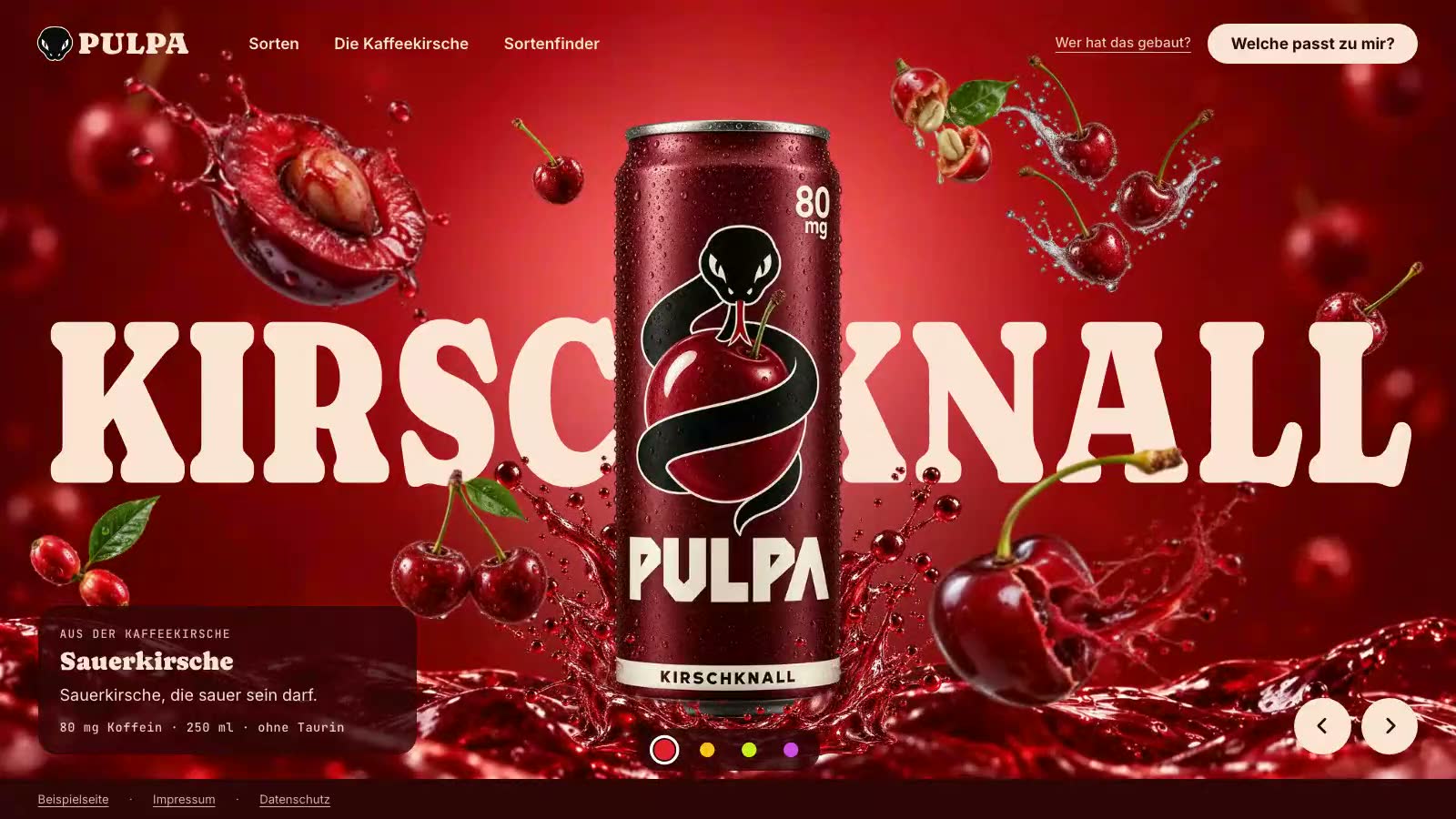
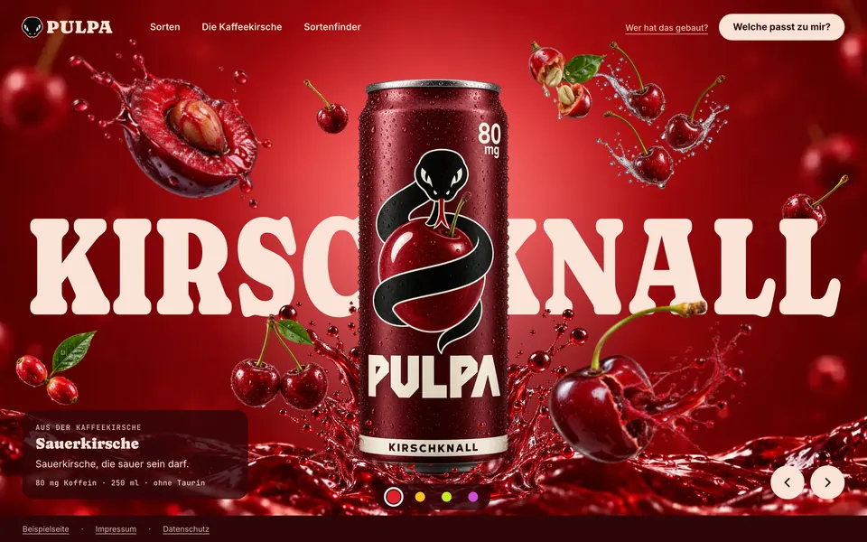
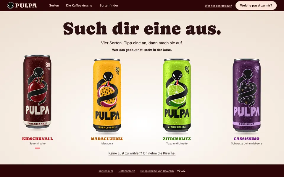
Up front PULPA plays it straight: four flavours, a logo, a can whose back label is correct. Only when you open a can does the page flip: “PULPA doesn't exist. This website does.” That is a pattern interrupt — a break with what the brain expects, and that is why it sticks.
Anyone who gets as far as the tab was just about to buy something that doesn't exist. We have no better proof that a website can sell.
→ For that to work, the brand had to feel real. So we started with the brand, not with the site.
Brand first, then the site
Before a single line of code existed, we positioned PULPA the way we do for every client: who buys it, when, and what does it compete against? The answer: caffeine from the coffee cherry, 80 mg per can, no taurine — “Energy drinks are built for the night. PULPA is for the afternoon.” Plus a buyer with a name, an age and a daily routine, against whom every sentence had to hold up.
We checked name, flavours and logo against the market. One assumption fell over at once: drinks made from the coffee cherry already exist, in Berlin. For a showcase we noted it openly; for a real client, that would have been the moment to re-plan.
Why all this effort for an invented brand? Because a website without a story stays decoration. The effects that follow are only as good as the reason they are there.
→ And every one of them has a reason.
Every effect has a job
Nothing on PULPA is decoration. Every effect takes on a job that a salesperson would do on a real website: getting attention, building trust, explaining, advising, leading to action. The clips are recordings; on the site itself the browser calculates every movement at the moment you scroll, swipe or tap.
- 01 / 06
Swipe through the flavours
- Its job
- Getting attention in the first three seconds — before anyone clicks away.
- What happens
- The can stays put while colour, fruit and lettering change with every flavour — by swiping, arrow or scrolling.
- How it's made
- The stage is made of separate layers: background, can, fruit, splashes and the flavour name as real text. Each layer moves at its own pace, which creates the depth. Because the name is text and not an image, it stays sharp and readable for search engines.
- For you:
- your services or models as a stage the customer swipes through, instead of a list to read.
- 02 / 06
The can turns around
- Its job
- Trust: what's inside is printed on the can, and nobody has to go looking for it.
- What happens
- As you scroll, a real 3D can turns to its back, the 80 mg of caffeine count up, and the mandatory notice stands next to it word for word.
- How it's made
- The can is a real 3D model rendered in the browser; the label is a flat print template wrapped around it. The rotation is tied to scrolling: scroll back and it turns back. The text on the back is real text, so the mandatory notice is word for word correct. Devices without 3D support get still images.
- For you:
- the product from every side, with the details exactly where the customer is looking.
- 03 / 06
Pouring instead of a dividing line
- Its job
- Keeping the thread: the transition carries the visitor into the next chapter instead of cutting them off with a line.
- What happens
- Between two sections a can tips over, and the page fills with lemonade, bubbles rising through it.
- How it's made
- The lemonade is drawn live, not played back: a wavy surface, bubbles at three depths, light rays, fruit fibres that swirl up as you scroll. Measured, it runs at 60 frames per second.
- For you:
- transitions made from your own material — wood, concrete, water — instead of grey lines between boxes.
- 04 / 06
The coffee cherry breaks open
- Its job
- Explaining the one unknown — caffeine grows on a cherry — so that nobody forgets it again.
- What happens
- A cherry falls through the drink and opens until seed and pulp lie side by side, labelled.
- How it's made
- Whole cherry, halves and seeds are separate images in the same light, so nothing jumps as it breaks open. Everything hangs on a single scroll value: forwards the cherry opens, backwards it closes again. The labels are real text.
- For you:
- the one thing customers don't know about your craft, unfolded step by step instead of explained in a paragraph.
- 05 / 06
The flavour finder as a game
- Its job
- Advising: three questions turn “which one should I take?” into a recommendation.
- What happens
- Three questions, a wheel of cans that turns along, and at the end the right flavour — the page takes on its colour.
- How it's made
- Three questions with four answers each; every answer scores points for one flavour. Next to them a wheel of four 3D cans turns like a wheel of fortune with a springy finish. The result colours the whole page, and the button leads straight to the matching can.
- For you:
- needs assessment that is fun and ends at the right offer instead of the price list.
- 06 / 06
Pull the tab
- Its job
- Action: curiosity becomes a movement, and the movement becomes an enquiry.
- What happens
- Open a can and watch the page turn over and become a RAVARO website. The moment the whole page was built for.
- How it's made
- Pull, tap, click or keyboard: every gesture has a second way. After opening, the camera moves onto the lid, a circle in RAVARO's dark ground grows across the page, and the colours change from the brand to us.
- For you:
- the moment curiosity turns into an enquiry — with a gesture instead of a form.
→ This much movement has a price if you build it wrong. We built it so that it costs nothing.
Built like a product
Most sites with effects like these play videos. That is heavy, blurry and slow on a phone. PULPA is made of layers instead: background, can, fruit and splashes lie on top of each other separately, 28 image layers for four flavours, plus a real 3D can and lemonade drawn live.
We measure the result instead of claiming it: 100 out of 100 points in Google Lighthouse on a phone, the largest image visible after 1.8 seconds, not a single request to third-party servers, no cookies. Speed is not a technical detail — every second of waiting costs visitors before they have seen anything at all.
Measured
→ Whether the site works, though, was not ours to decide.
Measured with WebGainer, not by gut feeling
Whether a site works isn't decided by our feeling but by WebGainer, our own testing tool: 80 checkpoints from the first impression to the path to an enquiry, and at the end a score out of 100. So that the score doesn't turn out friendly, the measuring is done by a review that didn't build the site.
The first measurement gave 57 and found what our own checks had missed: whoever doesn't pull the tab never sees the sentence that explains the page. Round by round we worked through the findings and measured again, up to 84. The last round comes with an honest note: only then did the review know that visitors come from ravaro.de and already know RAVARO.
The same tool measures your website too, in about a minute, free of charge and without a sales call.
→ Not every round went smoothly. What went wrong is part of the story.
What went wrong and what we learned from it
- What happened
The first outside review found what our own checks had missed: whoever doesn't pull the tab never sees the sentence that explains the page.
→ What we do differently sinceSince then a visible path leads there, and the page gives a nudge if you wait too long.
- What happened
On the first build the turning can froze the page, because the frame rate doubled with every frame.
→ What we do differently sinceSince then motion is measured — frames per second, frames at rest — not just looked at.
- What happened
At first the tab could only be pulled, not tapped.
→ What we do differently sinceEvery gesture now has a second way: tap, click, keyboard.
- What happened
A ready-made form component addressed visitors formally on a page that speaks informally.
→ What we do differently sinceAdopted components are now checked for their form of address.
PULPA can't be bought. Recipe, flavours and label are invented, the images made with AI. We checked the legal details — imprint, privacy policy, the caffeine notice word for word — ourselves, not with a lawyer. The test on a real iPhone is still to come; it was checked with Safari's engine in the browser.
What this means for your website
PULPA is invented. What's behind it isn't: a clear positioning, a site that tells instead of lists, effects with a job, a load time that gives nothing away, and an outside review before anything goes live.
That is exactly how we build your website. And you see it before you decide.
A website that only looks nice is dead weight. Website Systems builds a site from your actual business goals — one that takes work off your plate and turns visitors into real enquiries.
MORE CASES ///
Next build
Jade Tempel
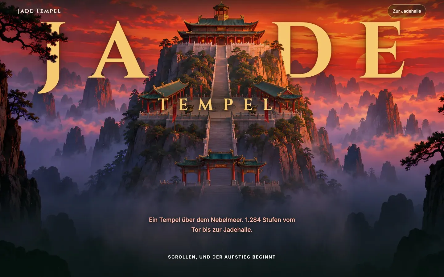
What if your guests had already walked the way to you before they set off? 1,284 steps, a hall of jade, a dragon after the storm — a website you don't look at, you climb it.
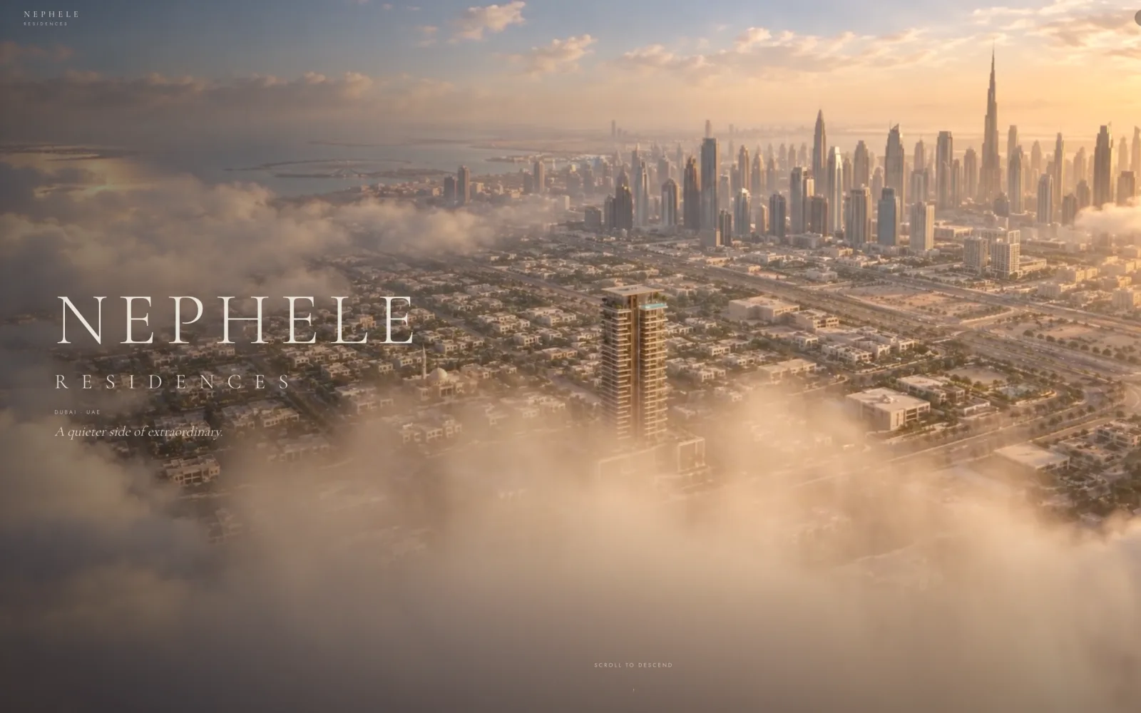
NEPHELE Residences
Nobody buys the development. They buy apartment A1803.
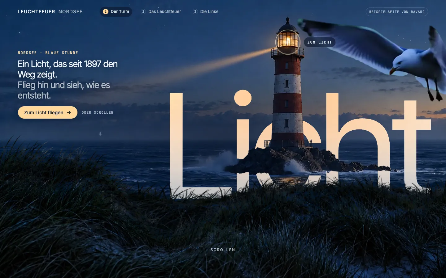
Leuchtfeuer Nordsee
Four days, ten versions, one lighthouse — and a lens you take apart yourself.
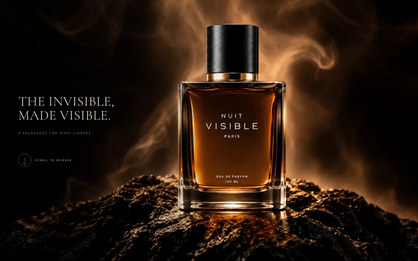
NUIT VISIBLE
A scent cannot be shown. So we let the scroll tell it.
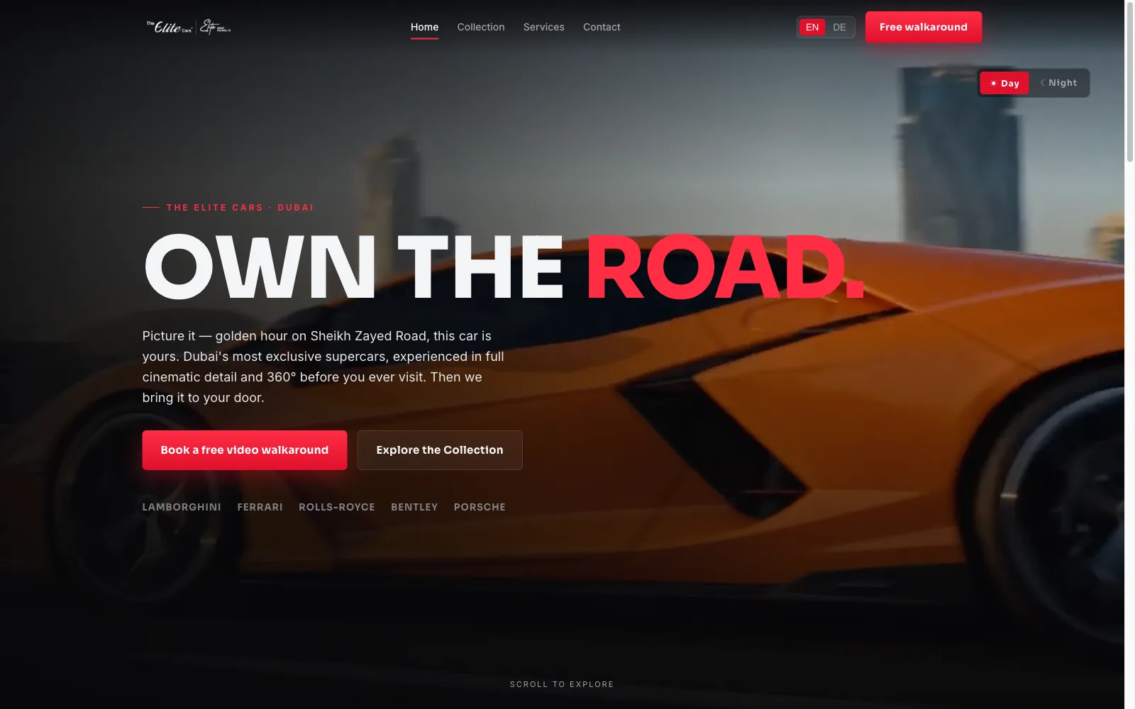
The Elite Cars
A supercar dealer whose website already looked good — and still could not sell a car to someone who didn't feel like driving over.
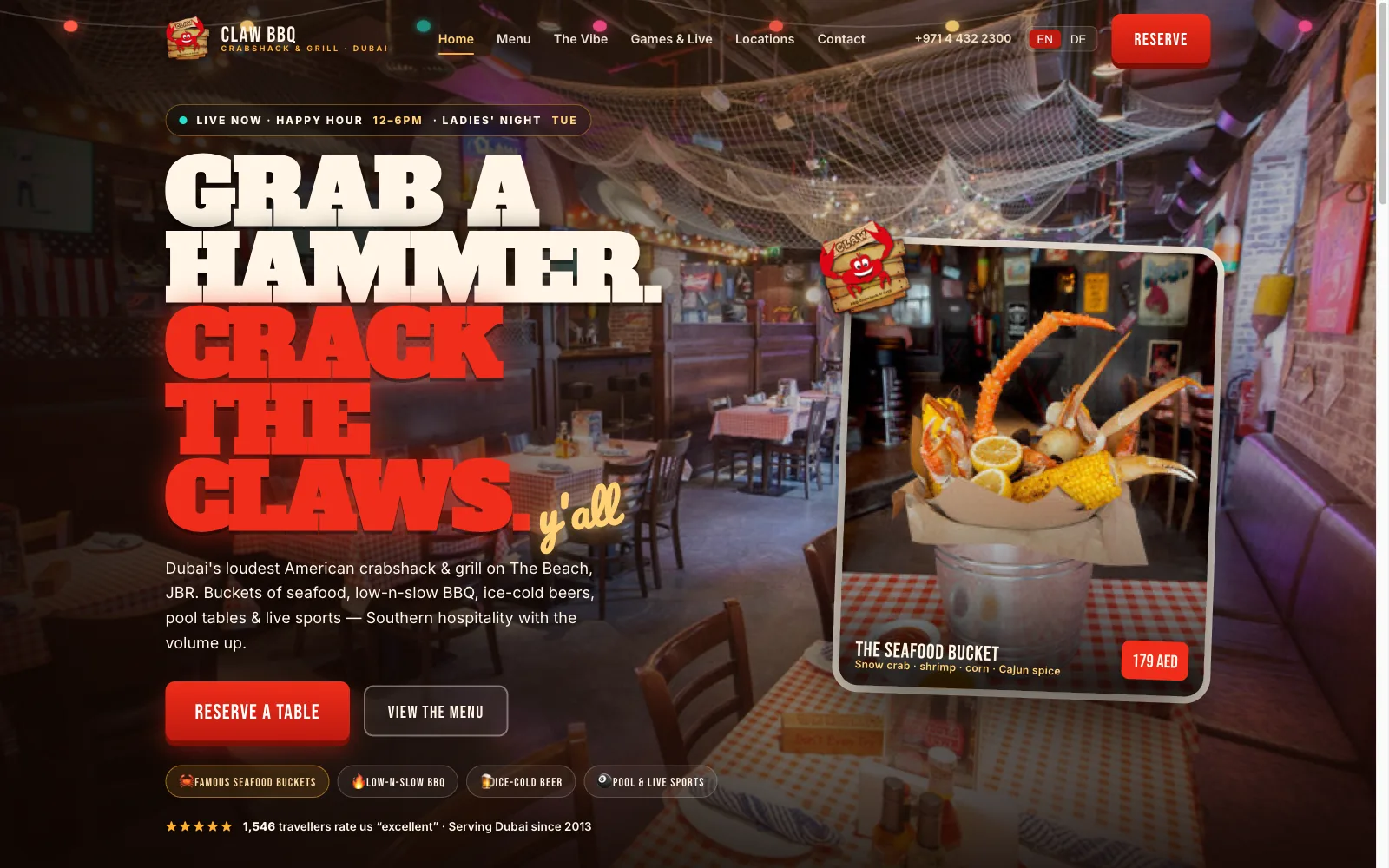
CLAW BBQ
I know this place. Their website did not.
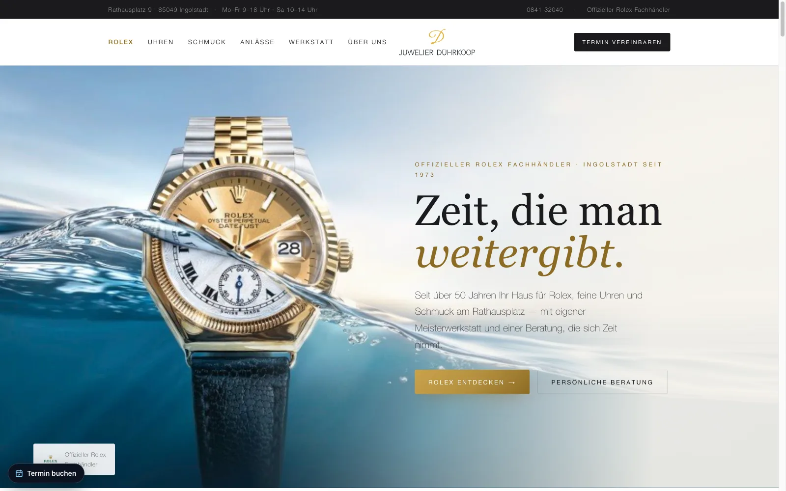
Juwelier Dührkoop
Fine watches, sold from a page you could not lean into.
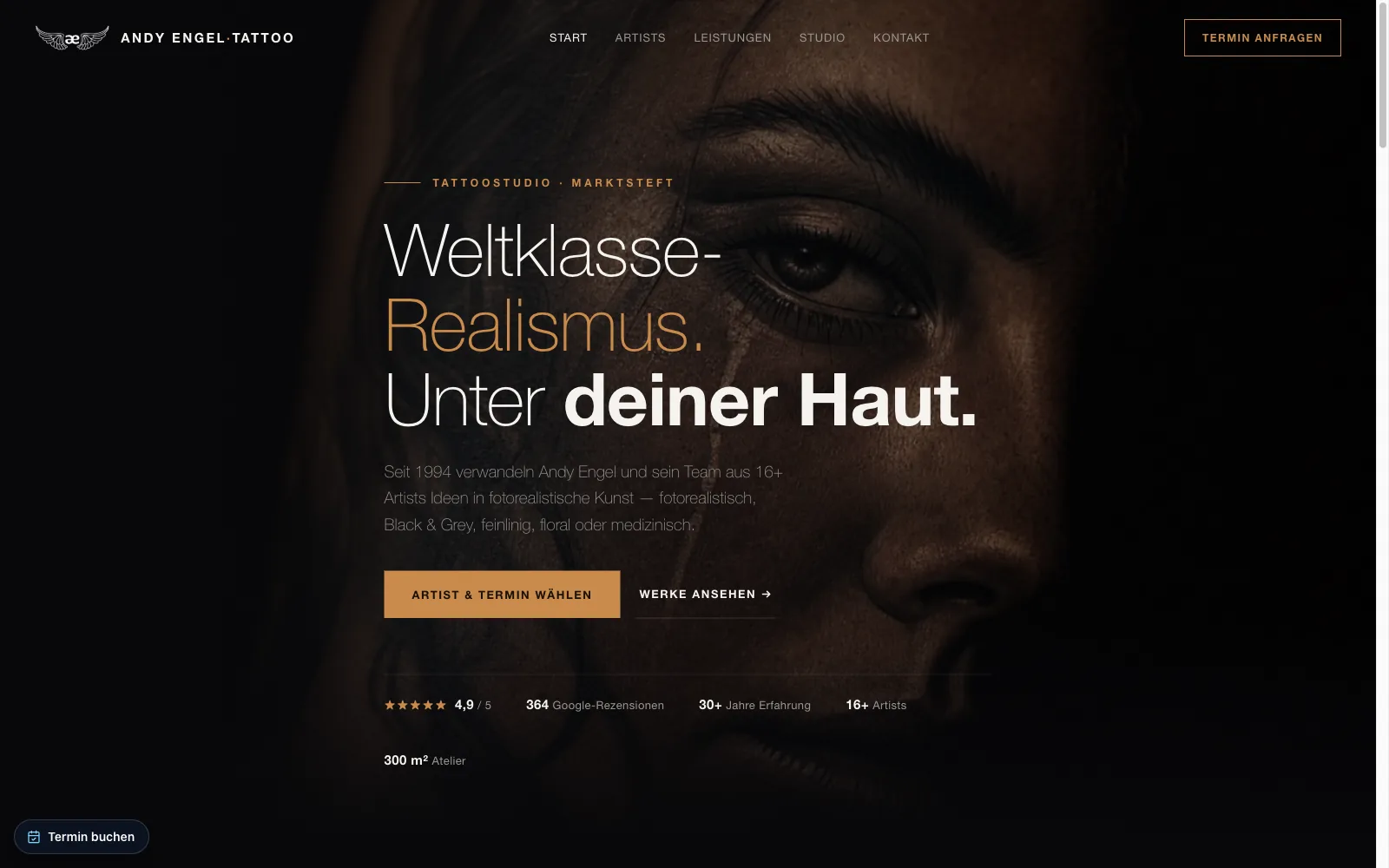
Andy Engel
A man people fly across continents for, with a website built for people driving past.
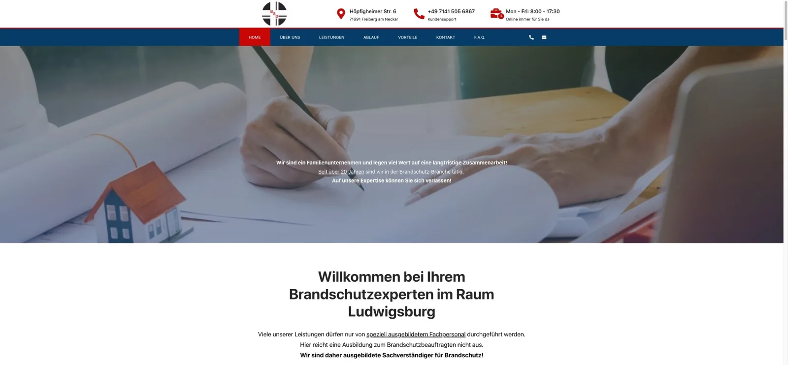
BSD Wiedemann
We stopped his website selling fire extinguishers, so the business could start selling expertise.
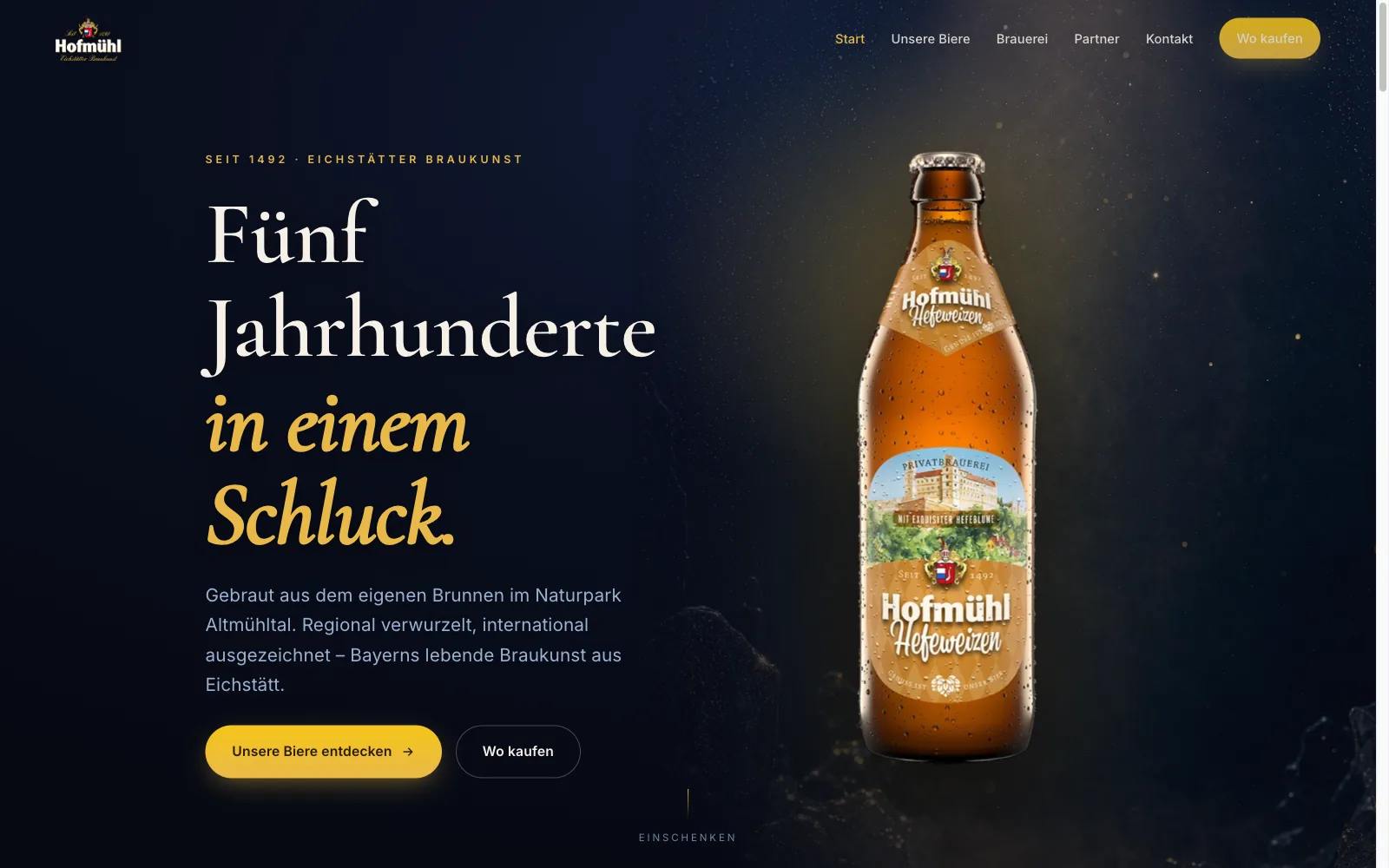
Hofmühl
A brewery does not sell beer on its website. It sells the reason someone reaches for that bottle in the shop.
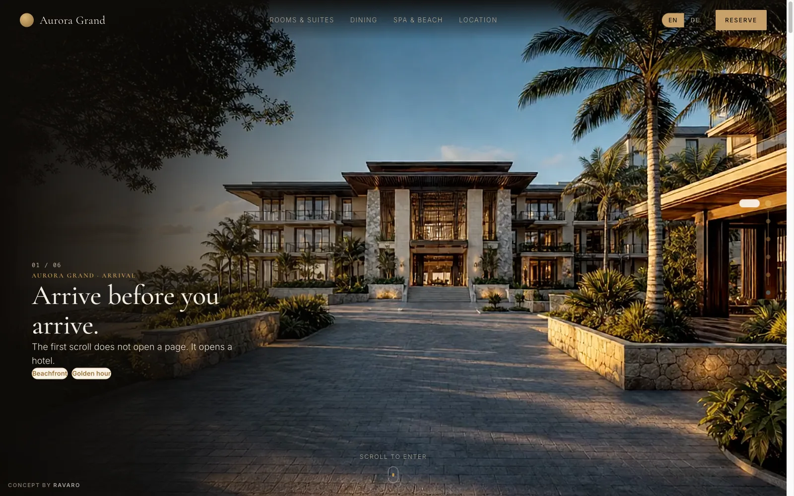
Aurora Grand
A hotel website you walk through before you book.
All our website work
Every project in this discipline — numbers, videos and results.